Design One:
I chose to use the colour white for my title as it stands out against the background image, it also have connotations of youth and innocence which conforms to my chosen genre: coming of age. I also chose white for the film credits and the tag line as I wanted these to be visible against the darker background image. I chose neutral tones for most elements of my poster such as yellows, golds, browns and white as this colour scheme fit best with the background image of the poster without drawing too much attention away from it. I chose a brown font for the quote from cosmopolitan magazine as it make the font stand out from the blue sky behind. The colour brown also has connotations of nature which implies growth which is the centre of the plot in my short film. I chose handwritten fonts for most of poster such as the title, tagline, actors name and the magazine quote. I did this as handwritten style fonts hint towards youth. The handwritten fonts appear fun instead of serious which is a similar theme to what we are portraying about youth seen through the tagline of the film 'Don't waste your youth growing up'. I also used a symmetrical look for this poster which was used for many of the posters I looked at in my research.
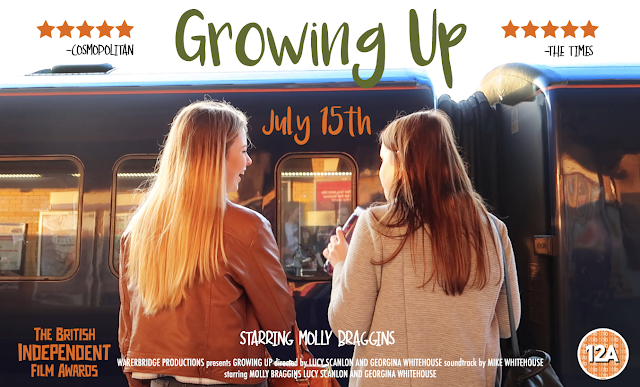
Design Two:
I chose a landscape layout for this poster as many of the poster I had analysed had been portrait and I wanted to make a product that would stand out. This poster uses a brighter colour scheme with colours such as green, orange, white and blue. I chose the orange tone of the star rating, release date and film award as the background photo was taken at sunset and I wanted to replicate these tones throughout the poster. To get the tones to match I used the colour eyedropper tool to make them the same colour as the orange/brown jacket seen in the shot. I used the colour green for the film title as green has connotations of nature and growth which conforms to my chosen genre. The green also stands out against the rest of the neutral orange and blue tones in the poster and the white background. The white used for the actors name and the credits also stands out but doesn't take attention away from the image and title. I also took a symmetrical approach towards this poster.


No comments:
Post a Comment