Initially we searched online for some downloadable fonts in a handwritten style, however none of them fit the exact style that we wanted. Therefore we decided to write our own titles, take pictures and then animate them ourselves on Premiere Pro. To do this, we took two pictures of the titles written slightly different each time. We would then edit these on Premiere Pro and alternate the images to make it seem like the text was moving.
To start with we wrote our titles 'growing up' three times, one with the letters slightly slanted to the left, one with the letters fully upright and one with the letters slanted to the right. We taped these pieces of paper to a white board and placed it by the window where there was good lighting. We then took individual photos of these, making sure we held the camera at the same distance and level for all three photos. The image below shoes Georgie taking photos of the text.
However when it came to the editing we didn't like the finished look of the titles as we felt the images looked too different that when played together it didn't appear to be moving. We also thought the effect would look better if the text was written in whiteboard pen, therefore we decided to redo the titles this time on a whiteboard, these are the images we took for the titles the second time.
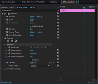
These two images worked better as they are very similar and only have small differences between them. To create the titles we loaded these images into Premiere Pro and inverted the colours, this made the background grey and the text a dull white. We then added the three-way colour correcting wheel onto the images and altered the highlights and shadows of the image to make the white board background jet black and the text bright white.
To animate our titles we copy and pasted these images next to each other several times for 0.2 seconds, this made the text appear as if it was wiggling on screen.


No comments:
Post a Comment